For my BA project I’m currently finalising the illustrations for each of 10 classical pieces of music for the a BBC “Ten Pieces” booklet. All of the pieces’ illustration will have this same look, and look a little abstract; trying to create images that people can relate to with the music but isn’t a specific image (music is conceptual after all). This one is for In the Hall of the Mountain King by Edvard Grieg.
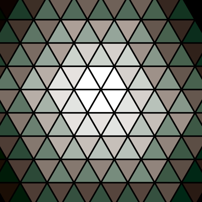
For this piece I looked into the pulse and rhythm rather than focusing mainly on the Mountain King story. If you imagine the piece as a circle rotating, it starts turning slowly and then gradually gets faster and faster. My first attempt involved using triangles to form a spiral and I wanted to link to the story’s mountain by making it look like the light at the end of the tunnel, give it a gem-like look and used greens and browns to resemble the colours of the mountain and/or the trolls.
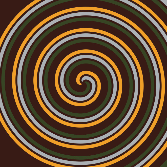
But I felt this didn’t really relate to the piece very well, and there were too many shades of colour in this illustration compared to the other pieces. I decided to start again and create a spiral with lighter colours; gold (to relate to the king), pale grey, a lighter brown and green (to relate to the mountain again). I would like to maybe have another go at this piece if I have the time, but what do you think? Do you prefer either of my attempts? Comment your opinions below.
Listen to In the Hall of the Mountain King below my picture or watch In the Hall of the Mountain King by the BBC National Orchestra of Wales for ‘Ten Pieces’.
UPDATE: My Ten Pieces project is now complete and can be seen in the projects section.
First attempt:
Final idea:
https://www.youtube.com/watch?v=hDi8Smb4KeI&index=7&list=WL


