Book covers are a unique and wonderful art form. It’s no simple task to boil down hundreds of pages of well-considered words into a single image or design and still make it compelling enough for people to want to pick it up. Book design can sometimes make or break the success of a book. It requires wit, knowledge of design fundamentals, and an overwhelming amount of creativity.
In other words people DO judge a book by it’s cover.
This post is part of my new series called “10 Pin Bowling” where I take 10 examples of graphic design work which I find inspiring! This can involve logo design, posters, illustrations, photography, graphic designs, and the list could go on. I’ll even be going for double strikes or turkeys with design work I will have posted about; meaning there will be more than one posts on graphic design areas like resumes. But for now here is another STRIKE in the series of brilliant book covers which stand out from the rest and represent their contents vividly. Which is your favourite? Do you have any other favourites? Comment below. And you can keep up with future 10 Pin Bowling posts on Facebook and Twitter via the hashtag: #10PinDesign
[one_half]
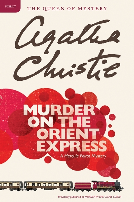
This book is part of the Hercule Poirot Mysteries Collection and I love the colour and style. The creme colour background makes it look like luxury paper used for letters and with the Agatha Christie script-like signature, it gives the book a nostalgic look. The train smoke is in circles and in red almost looks like drops of blood spilling modernising it a little and linking with the murder/mystery genre.
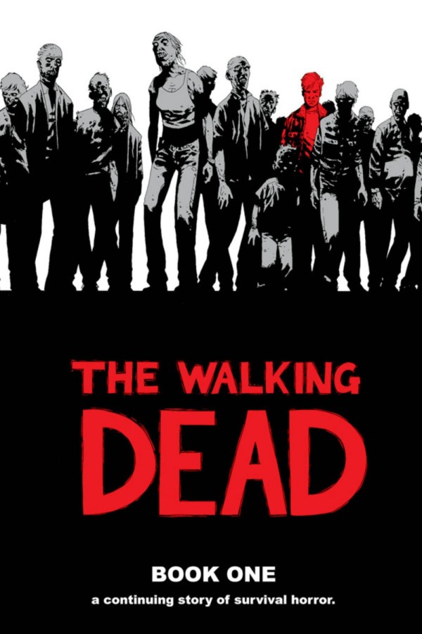
Of course with graphic novel the style of drawings inside will always inspire the design of the cover. There are many variations of the Walking Dead comic series, but the covers designed for the hardback collection are probably my favourite for any graphic novel. The limited colour scheme (black, grey, white and an additional colour) give that special professional feel which collectors will appreciate. Half of the reason I got this version was for the book cover design!
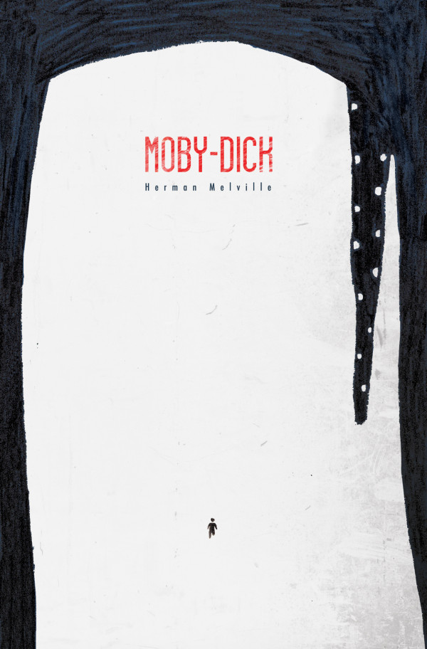
With most designs for Moby-Dick, there is usually emphasis on the size of the whale, and with this design the eye is shaped as a human to give the customer an idea of the whale’s proportion in size. The texture of the blue give motion to the sea and I prefer it to just having solid colours; the design is still minimalist and the colours contrast well, but the shades and rough edges (almost like a rough pen drawing) adds to the feel of the design.
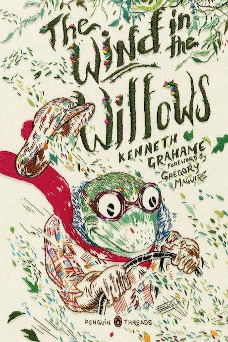
I very much like this style of design; Rachell Sumpter has also created covers like this for The Wonderful Wizard of Oz. The colours are very vibrant; different shades of green are mainly used to link with nature and the creatures in this book, and the bold red goes with the Mr Toad energetic personality. The small individual lines add motion to the design; both the speed of the car Mr Toad is driving and the flow of the wind.
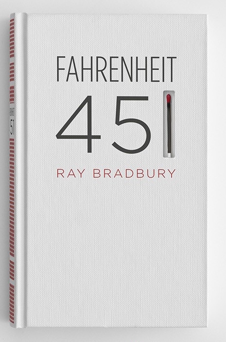
This is brilliant example of minimalist design working at it’s best. Firstly the cover itself has grey and dark red typography with a match replacing the number one in 451, and secondly adding a matchbox like strip on the binding; these clever little additions relate to the book’s theme of burning books and work extremely well! You can check out my own book cover design for Fahrenheit 451 by clicking here.
[/one_half]
[one_half_last]
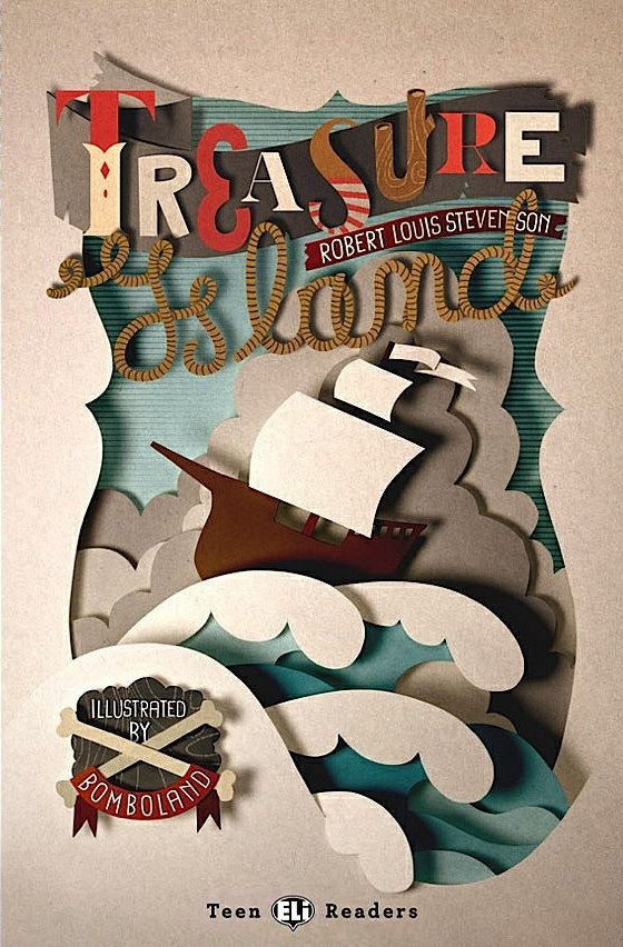
Here’s a nice unique way to go about designing a cover for a children’s classic. With the layering, paper textures and shadows, this design has a brilliant 3D look with a fun, vintage style about it which definitely appeals to children. The typography suits the style and has been created solely for the design with the montage of different types of paper letters and script-like type looking like rope, all with that ship-shape look.
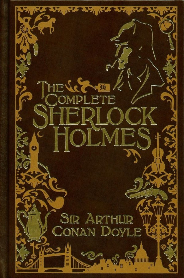
This book is part of Barnes and Noble Collectible Editions Series including classic collections by Lewis Carrol, Jules Verne and Hans Christian Anderson. The design uses beautiful golden foil embossing on top of brown leather; even just this traditional style of design should be enough to make you want to buy it. It has a montage of the iconic objects and shapes from the stories and that victorian era giving the book that special collector’s feel.
To Kill A Mockingbird is one of my favourite reads of all time and I think this is an appropriate cover. It has a child on a swing silhouetted in black giving a nostalgic reminiscent feel to the cover and because the story’s narrator talks about their childhood from that point of view this really works; like picturing a memory. On top of the black silhouettes, the sharp handwritten typography hints towards the dark themes of the book like racism, rape and abuse.
![]()
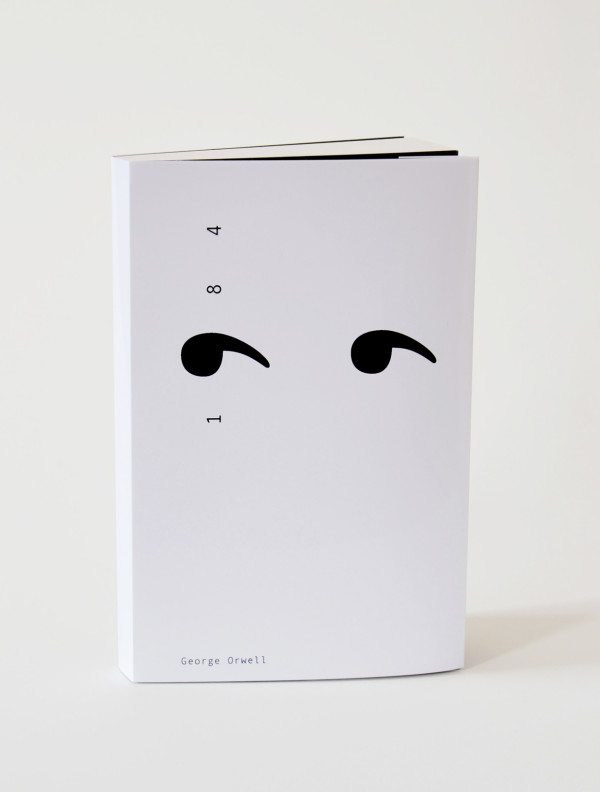
The ironic thing with this is that it stands out more because of its simplistic design. I love the minimalist look with this cover; simply by using the idea of ‘Big Brother’ or the ‘eye in the sky’, the number 9 has been manipulated and duplicated to look like a pair of eyes. The fact that it’s in black and white can even relate to the restriction with the characters in the story. You can check out my own book cover design for 1984 by clicking here.
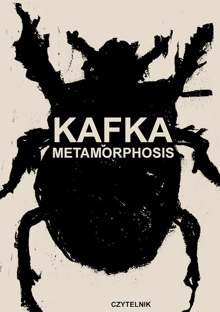
I don’t think this officially features as a cover for Metamorphosis, but I think it portrays it perfectly! The black ink print has a grungy disgusting look and truly emphasises people’s impressions of a horrible human-sized beetle walking about. The black ink almost pollutes the cream background; I think cream is better than white as it doesn’t seem too typical but still contrasts nicely.
[/one_half_last]
You can check out my ILLUSTRATIONS board (with book designs, posters, and illustrative styles) on Pinterest via the link below: