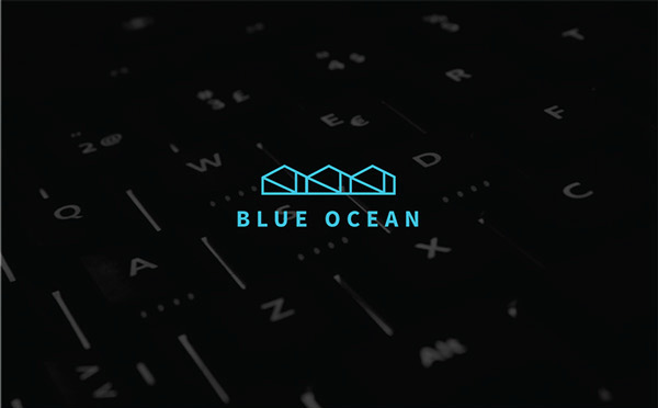
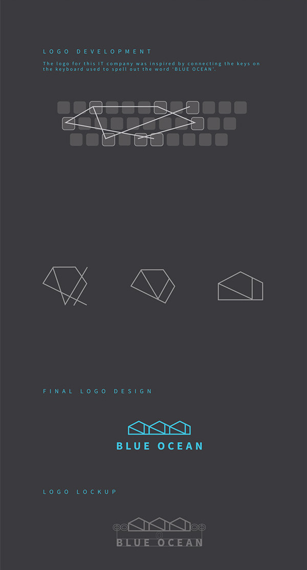
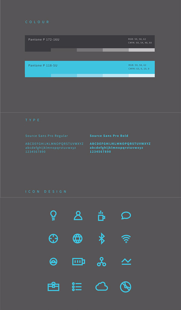
Rebecca Ho, a graphic designer from New Zealand has created a simplistic stylish logo for the ‘Blue Ocean Business Solutions’ IT company. What is interesting about this logo is it’s origin and design process; by connecting the letters when spelling out “Blue Ocean” on a keyboard, Rebecca used the shapes formed, simplified and repeated the shape to create her final logo. It’s geometric shape and bold blue lines fit perfectly as the solution for the project.
You can see more of her project on behance via the link below.


