Are you into old school designs or should they be back to the future? In the last month there have been quite a few brands freshening up their logos like Guinness, Instagram, Polo Mints, Eventbrite and more recently Co-Operative. All of these brands have decided to keep the framework of their iconic logos but to freshen them up with either a more traditional look or to modernise their previous logos by simplifying and/or adding gradients. Have a look at the revamped designs below and see what you think of each! Better or worse?
Guinness
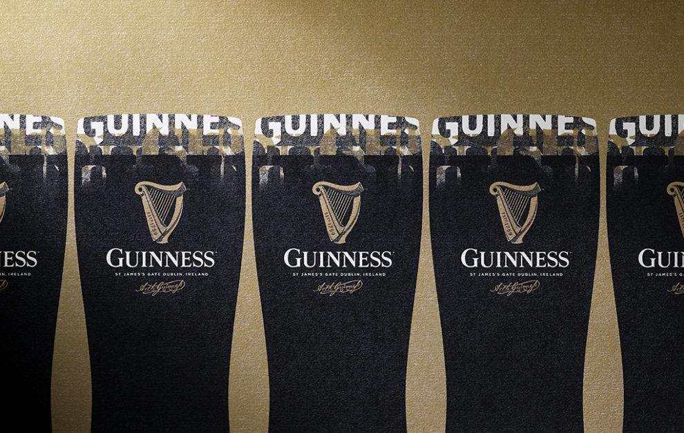
This is one occasion when it’s acceptable to be intricate and traditional with a logo. The Guinness logo was established in 1759; 257 years ago, so it was a brilliant idea to emphasis the age with it’s brand and it’s ongoing success! The previous logo was too minimalist for me and didn’t really say anything, but this has an eternal character emphasising it’s popularity through the years!
previous logo >

Eventbrite
This logo on the other hand has gone for the opposite of Guinness and went with a more minimalist look. Taking away the distorted box, slanted text and gone for a more clean cut font using the ‘E’ as it’s official icon, this logo has used just the typography to speak for it. To be honest I’m finding it quite hard to decided between the two as they both have the same energy about them.
< previous logo
Polo Mints
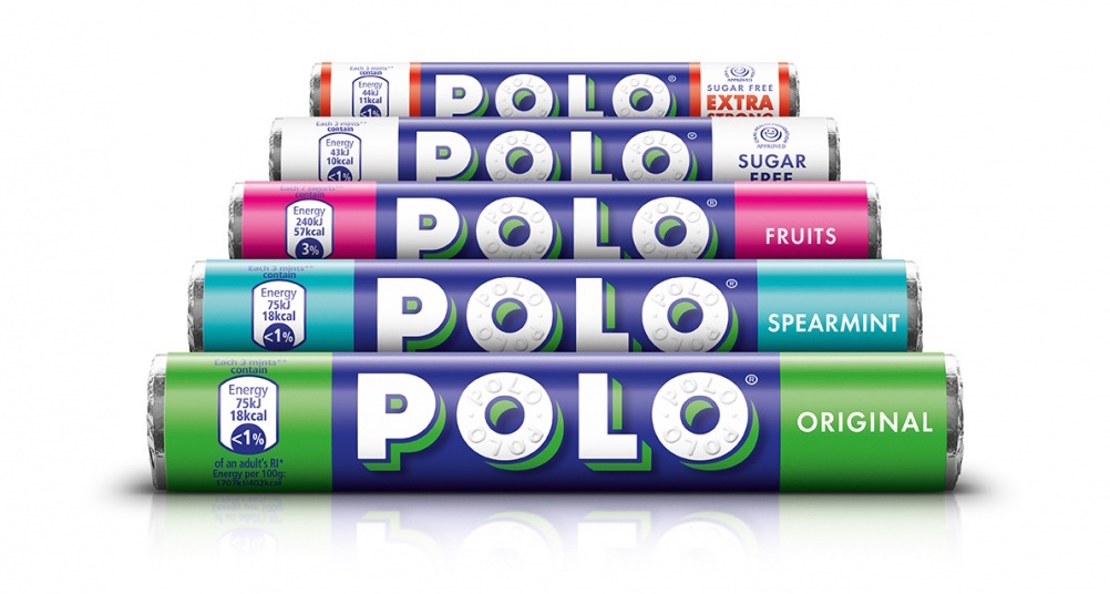
We’ve probably all grown up with the same Polo Mints logo, but now the logo has been refreshed for the first time in long while. This logo has been modernised but still retains the same contemporary typography and style of it’s predecessors. The whites are bolder and the shaped green shadow gives it a clear look and emphasises its contemporary look against the blue.
previous logo >
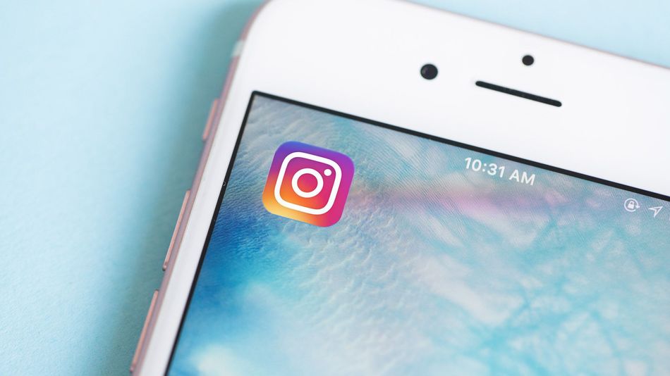

Instagram has removed the detailed retro style of it’s logo and gone more minimalist as well. It has only utilised the outlines of the camera, lens and flash of the previous camera and created white lines of them on top of a gradient of colour. It certainly modernises the logo and does looking appealing on you iPhone, but I feel Instagram is beginning to lose it’s retro side, which was what seemed cool about the app itself.
< previous logo
Co-Operative
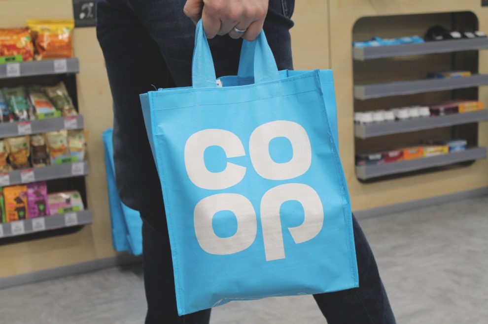
“Remember me?” That was going to be the tagline to introduce the familiar logo. This logo is actually about 50 years old, but has stood the test of time, so with a little refinement and a lighter blue to go with it, the old 4-leave clover logo is back again! It is a friendly and enticing logo; it’s a wonder why Co-Op ever went away from it. So while going through a bad period in the last few years, the company made the right decision to go back to their original aims and logo to regain their customers’ interest.
previous logo >
