Logo design may be one of the most challenging tasks a designer can face; making it memorable, able to represent its organisation/brand and unique enough that it doesn’t make you think of another organisation/brand. Some of the most famous logos in world are in the simplest form: Apple, Nike, Twitter, Pepsi and so many more. Some fall into the category of ‘anyone could have done that’, but most people don’t understand or appreciate the work and thought process that goes into creating a corporate identity and how much information can be found within those few shapes, lines and colours.
This post is part of my new series called “10 Pin Bowling” where I’ll be taking 10 examples of graphic design work which I find inspiring! This can involve logo design, posters, illustrations, photography, graphic designs, and the list could go on. I’ll even be going for double strikes or turkeys with design work I will have posted about; meaning there will be more than one posts on graphic design areas like resumes. But for now here is a STRIKE of brilliant ideas simplified to create professional looking logos. Which is your favourite? Do you have any other favourites? Comment below. And you can keep up with future 10 Pin Bowling posts on Facebook and Twitter via the hashtag: #10PinDesign
[one_half]
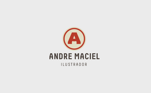
Andre Machiel (from California)
Such a clever and simple idea, combing the first initial and a pencil in the negative space; Andre could have chosen to use a 2D pencil outline, but this give the logo depth and it would have just looked like a normal ‘A’. The pale red & cream of the logo and the grey typography below the logo go well together and relate to the colours of a pencil.
Andreja Popovic (from Serbia)
This logo merges the letter A and the letter P while showing a pencil in the negative space. As well as this a black ring is put around the logo, all in black, giving a prominent look which contrasts extremely well against most lighter background colours especially white.
![]()
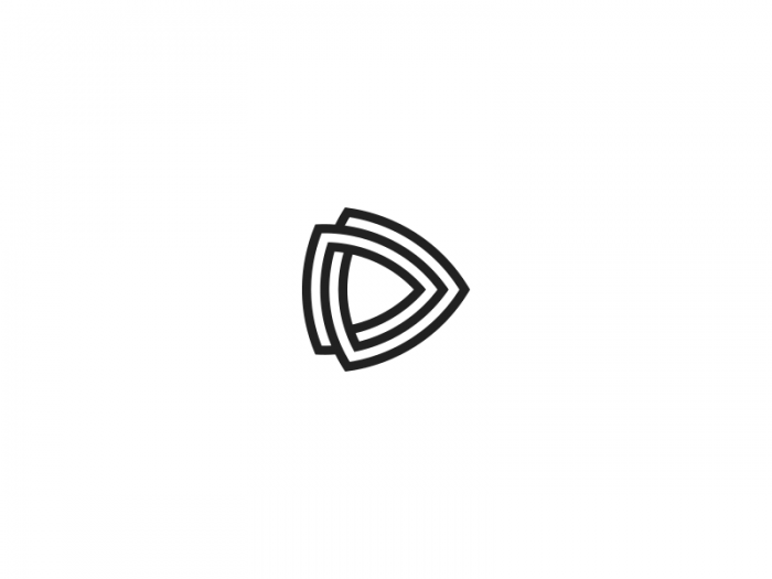
Jonas Soder (from Germany)
Jonas has created a series of monogram logo designs, but this is one of his best ones; combining two letter D’s together almost like a links in a chain. The D’s are not their typical shapes and look more like a curved triangular logo/icon and not just the two stuck together. Again the black works well contrasting with the white and brings out shapes professionally.
Brutus (from Vietnam)
Here is a cool minimalist logo representing the shape of a stag’s head. The circle outline around the logo is very effective connecting the shapes together; it is more unique and look like a professional logo than just the minimalist head and antlers.
![]()
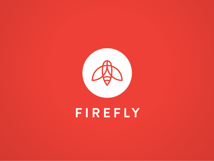
Matt Stevens (from North Carolina)
Using simple lines Matt has created a refined version of a firefly on top of a white circle. The colours white and red are a nice combination bringing warmth to the look and I prefer the white logo and red background as to the other way round.
[/one_half]
[one_half_last]
For this logo, it’s main source of inspiration came from the letter B for Bitcoin and hope of growth in a dynamic future. So the outer shape of a letter B was used and lines within the shape which look like they are ascending, bringing positivity about the logo. The blue and white which is a nice light combination symbolising trust, honesty, and almost represents colours of the sky; maybe going with the phrase, “The skies the limit”.
![]()
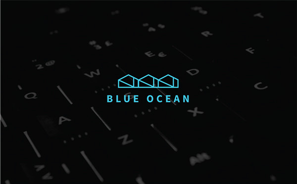
Rebecca Ho (from New Zealand)
This logo was designed for an IT company called Blue Ocean. By connecting the letters when spelling out “Blue Ocean” on a keyboard, Rebecca used the shapes formed, simplified and repeated the shape to create her final logo. The light blue obviously links with Blue Ocean but against black almost has an electrical neon look.
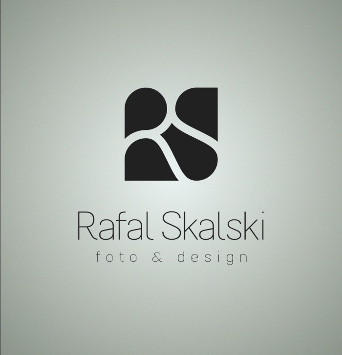
Rafal Skalski (from Poland)
The logo combines Rafal Skalski’s initials and uses negative space to show them within a square ratio. Black works really well with this logo as highlights the negative space more so people will see the initials; if there were multiple colours people would be more focused on the shapes.
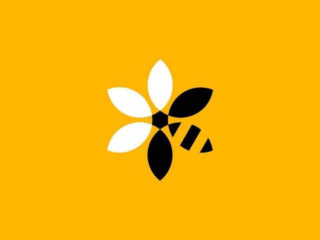
Here is a brilliant example of merging two images together for a logo. Although a white flower on it’s own would have looked nice, the integration of the black bee makes the logo a lot more interesting and lively. I can also see black and yellow working well with the logo’s colour choice on top of white.
Paul MacGregor (from London)
I love the simple use of lines to represent a sunset/rise with it’s reflection on water within a circle shape. The semi-circle could have been filled with red but instead uses the outline which makes the logo more consistent and subtle; would have been too bold otherwise. Even although the overall logo is geometric, the corners/edges of the lines and typography are rounded to give the logo even more subtly.
[/one_half_last]
You can check out my LOGO DESIGNS board (with simple, hipster, typographic, gradient and more logos) on Pinterest via the link below:
It’s always great feeling when someone notice your commitment and passion in design. Finding my project among all these brilliant examples is a great honor for me. Thank you Andrew!
No problem. Great job again! 😀