A resume can make the difference on whether an employer glances for a second, gets bored and put your resume in the recycling bin (or straight in the bin if they are repulsed by it). OR if they are intrigued and ask you to an interview, if not offer you a job! Graphic Design resumes not only list the skills and attributes that you can bring to the company but can show off your personality, show your professionalism through a well laid out structure; it almost acts like an infographic making it stand out, enjoyable to look through and more memorable than other resumes.
This post is the first of my new series called “10 Pin Bowling” where I’ll be taking 10 examples of graphic design work which I find inspiring! This can involve logo design, posters, illustrations, photography, graphic designs, and the list could go on. I’ll even be going for double strikes or turkeys with design work I will have posted about; meaning there will be more than one posts on graphic design areas like resumes. But for now here is a STRIKE of brilliant resume examples which would definitely grab employer’s attention. Which is your favourite? Do you have any other favourites? Comment below. And you can keep up with future 10 Pin Bowling posts on Facebook and Twitter via the hashtag: #10PinDesign
[one_half]
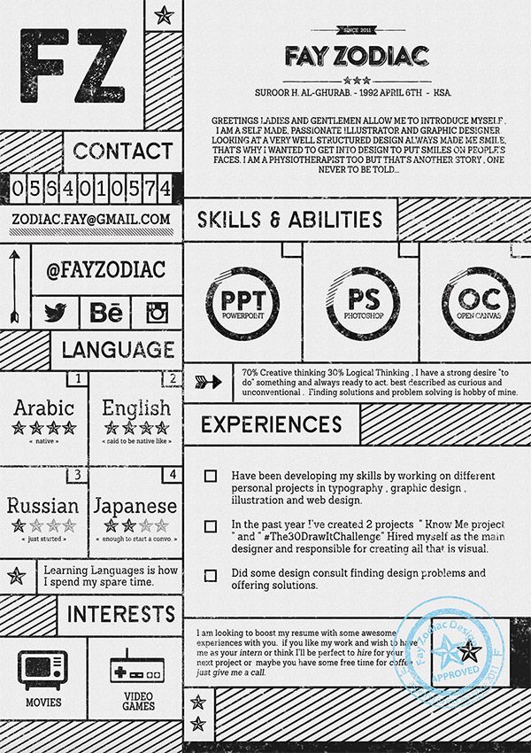
Fray Zodiac (from Saudi Arabia)
I like the hipster-like design with this resume: with the bold shadowed sans-serif fonts, additional icons and texture over print to roughen it up a little. Simple colour choices as well: black ink on grey paper with blue “approved” stamp as an addition.
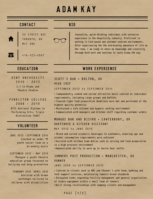
Jade Williamson (from Canada)
What I like about this is the nostalgic and simplistic look. I am very much a ‘less is more’ fan and I feel the black ink on top of brown paper is very nice; any additional colours would change the feel of the design. The thin sans-serif fonts have slightly wide letter-spacing which gives the resume more breathing space for employers to read through.
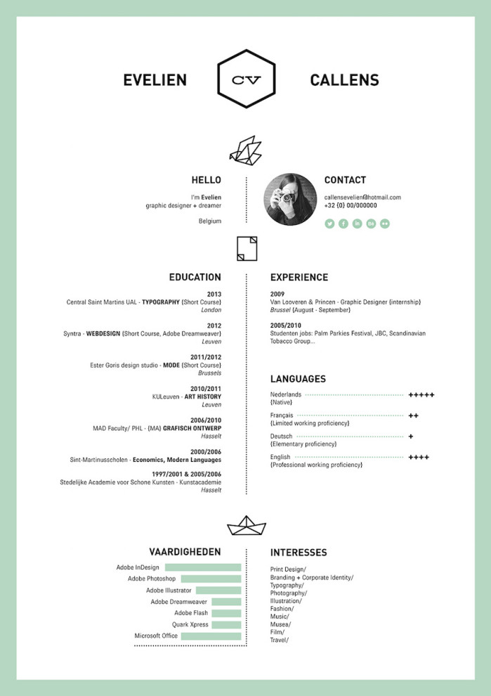
Evelien Callens (from Belgium)
Personally I feel if a resume is printed on white paper it really works well restricting colour to 2; usually black and a favoured colour which contrasts against white which in this resume’s case works well. Love the white space with this too as it’s uncommon with resumes; people want to get as much information in a possible but it can often put an employer off if they are overwhelmed with info. Plus it looks nicer!
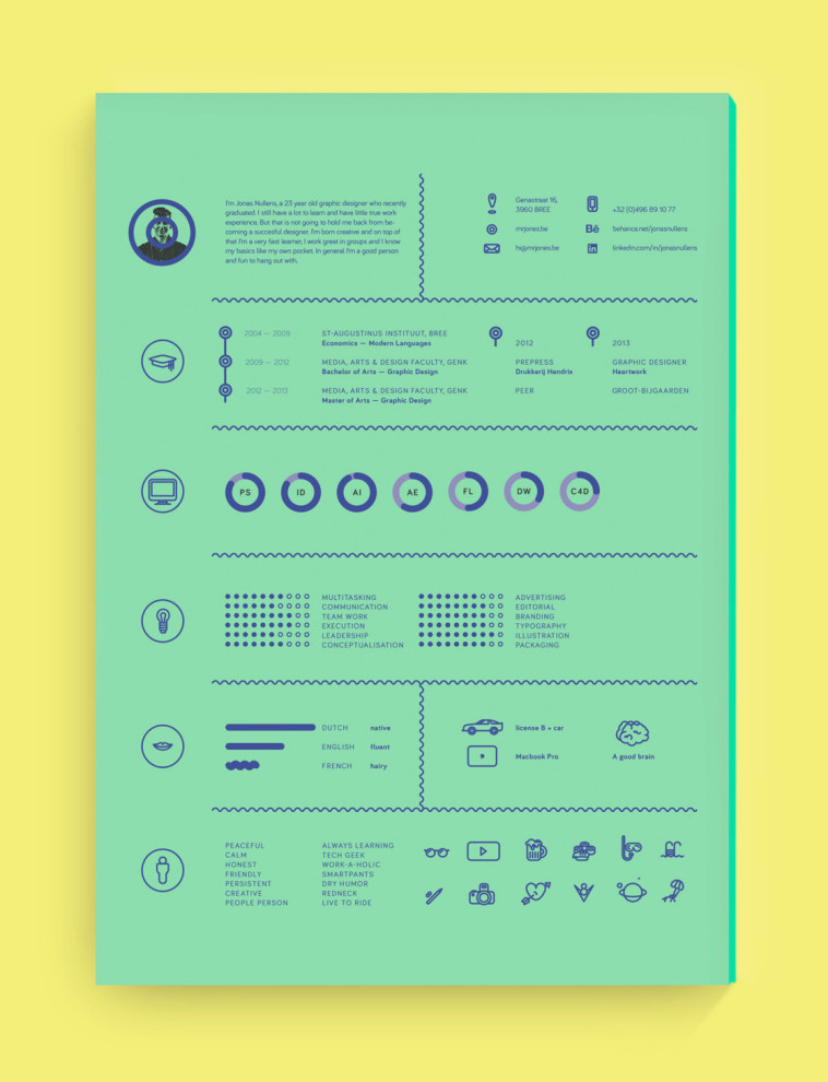
Jonas Nullens (from Belgium)
What I especially like with this resume is the difference with paper colour; compared to resumes using neutral coloured papers this will stand out to employers. The dark blue print works well with the green paper, and the page isn’t cluttered with information or squeezed together; the sections are spaced nicely and the simple icons go well with the modern look of the resume.
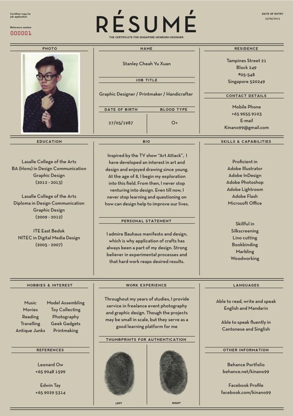
Stanley Cheah Yu Xuan (from Singapore)
This is one way of creating a resume while having a little fun with it and when I say little, I mean that; lots of people can go overboard with an idea, and can end up confusing an employer. With this though, the resume info and application form style idea pair together brilliantly with subtle links like the pale brown paper, finger prints, and blood type.
[/one_half]
[one_half_last]
Riccardo Sabatini (from Italy)
Riccardo has done many variations of this resume but I think this is probably the best out of all of the them. The colour choice with this resume is great; usually I only settle with one additional colour besides black, but I think the orange and light blue work well together and make the resume vibrant. I also like the combination of the tall sans-serif fonts, serif fonts and the arrow icons; gives it a modern feel.
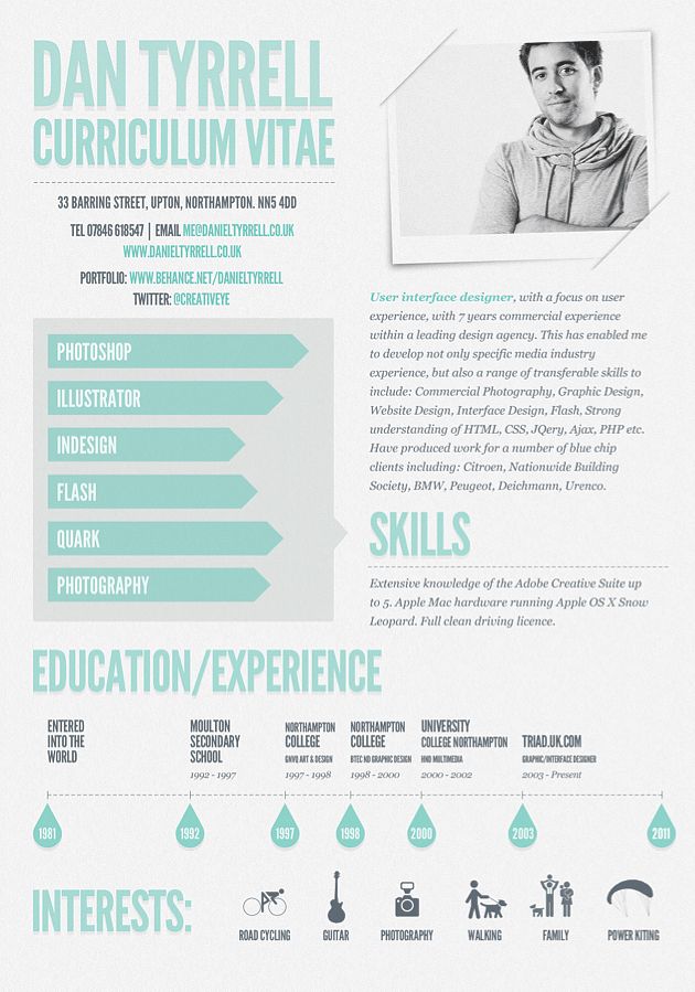
Dan Tyrrell (from England)
The subtlety and simplicity with this resume is great especially with the colours (light green and grey instead of typical black). Essential information has been shortened down so information doesn’t drag on; for instance the timeline combines the moments of education and experience which are usually separated because normally there is descriptions with experiences.
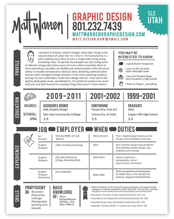
Matt Warren (from Utah, USA)
What I like about this resume is its layout and the horizontal sections each indicated by the title on its side going along the left side of the page; it’s easy to navigate your way through it. This resume also has a bit of fun by adding humour in the text; it’s not essential but gives it a little light heartedness. The colour combination is good again; I prefer the dark grey to bold black.
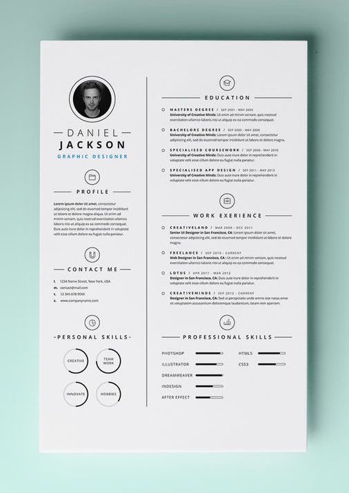
Daniel Jackson (Pixeden.com)
Black and white doesn’t necessarily mean that resume is just a cheap print. If used properly it can look bold and professional with design as it does with this example. The combination of the small and large column layout is commonly used, but is a nice way to lay out information and the sections have a good amount of space between them making the resume look professional.
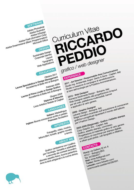
Riccardo Peddio (from Italy)
Personal resume created by Riccardo Peddio (from Italy). It’s always good to have an angle when creating a resume, but Riccardo Peddio has taken this quite literally. He goes away for the horizontal style of typical resumes/documents and uses left and right alignment along a diagonal line. Even although he uses Helvetica and there isn’t much difference to the typography/ layout, the resume will still stand out to employers.
[/one_half_last]
You can check out my PERSONAL EFFECTIVENESS board (with CVs, business cards, portfolios, etc) on Pinterest via the link below:


Love the idea for the series and the visual layout of the article. Great spot for designers to get inspiration for specific design projects. It would be interested your reasoning as to why you chose to feature these particular designs – what features make them inspiring to you? Thanks again for featuring me!
Thanks for advice. Taking it on board and now there’s a wee paragraph with each piece. 🙂 Will do this for future ’10 Pin Bowling’ posts.
Really nice collection Andrew (also on the Pinterest board)! Only it makes me a bit nervous, because I see here that we really need to step up with the resumes we sell on our site Kukook.com 🙂